Millife
For Millife, the challenge was to create a brand identity that celebrated the deep
cultural and human roots behind the millet. This is the direction the client chose,
and with good reason—it beautifully brought together tradition, craft, and
purpose.
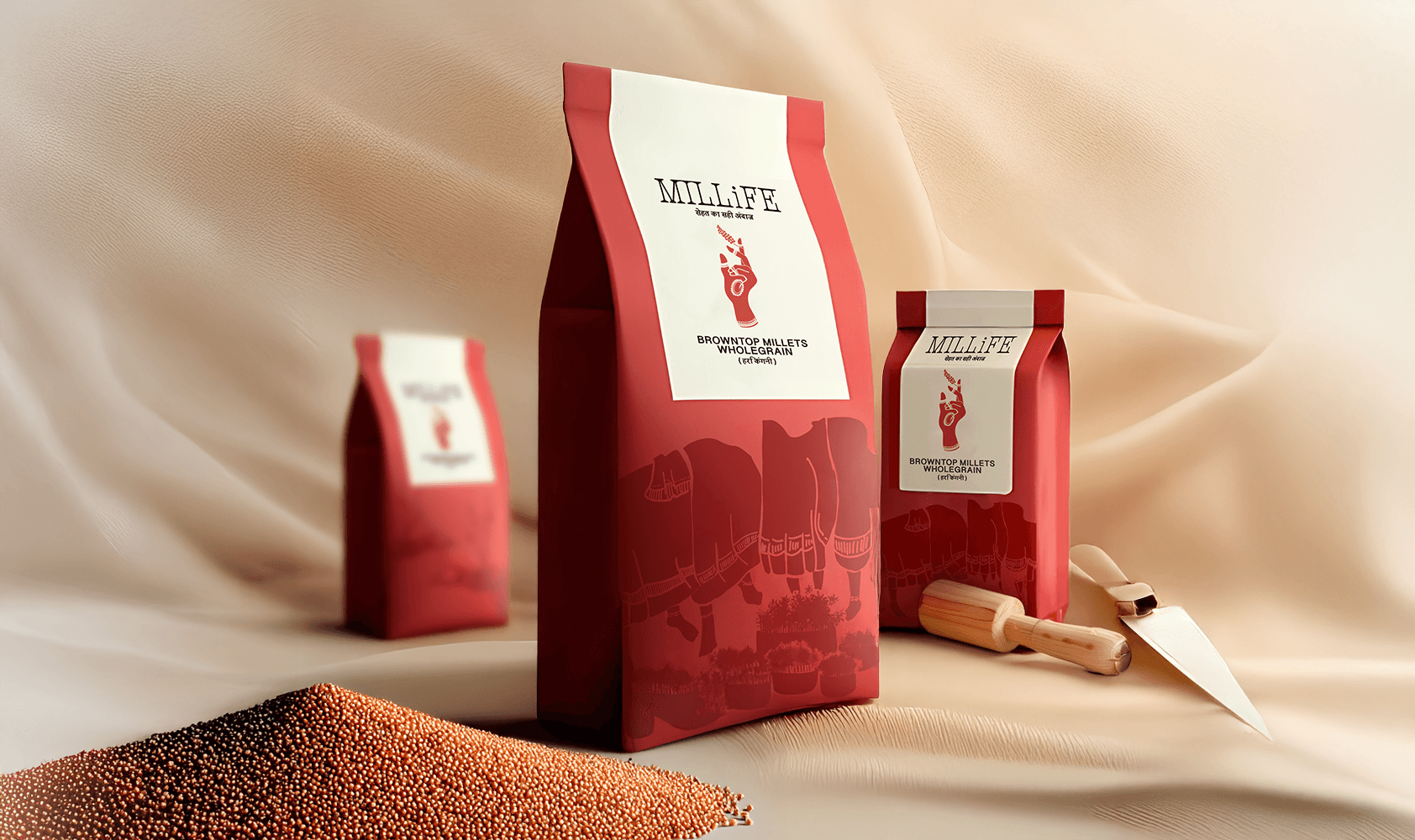
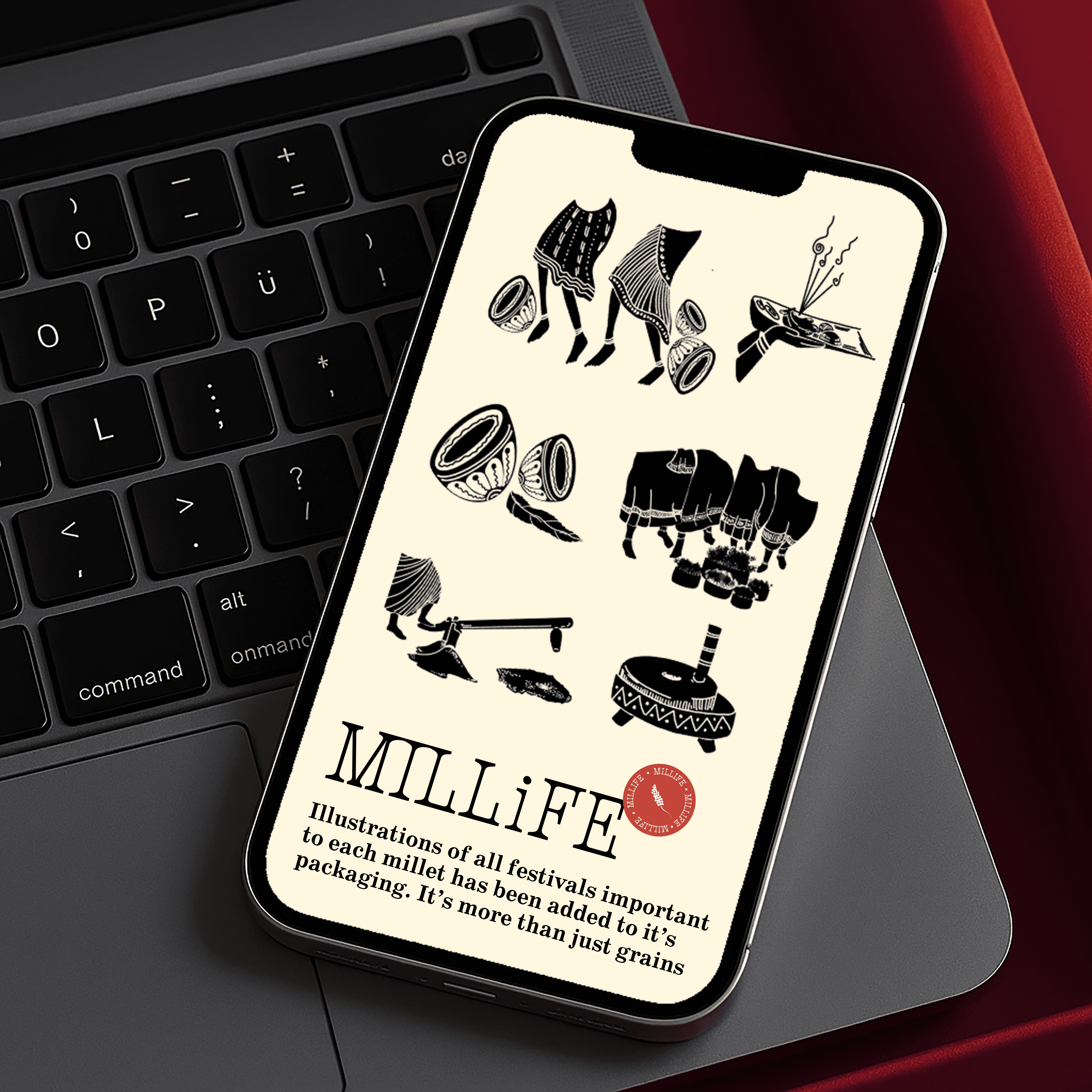
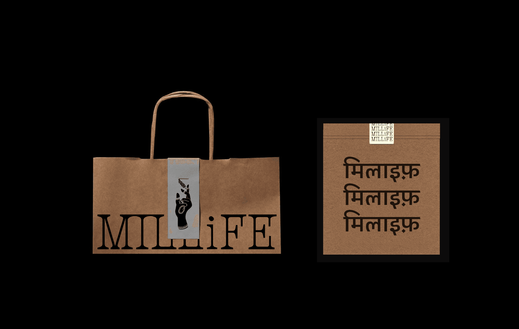
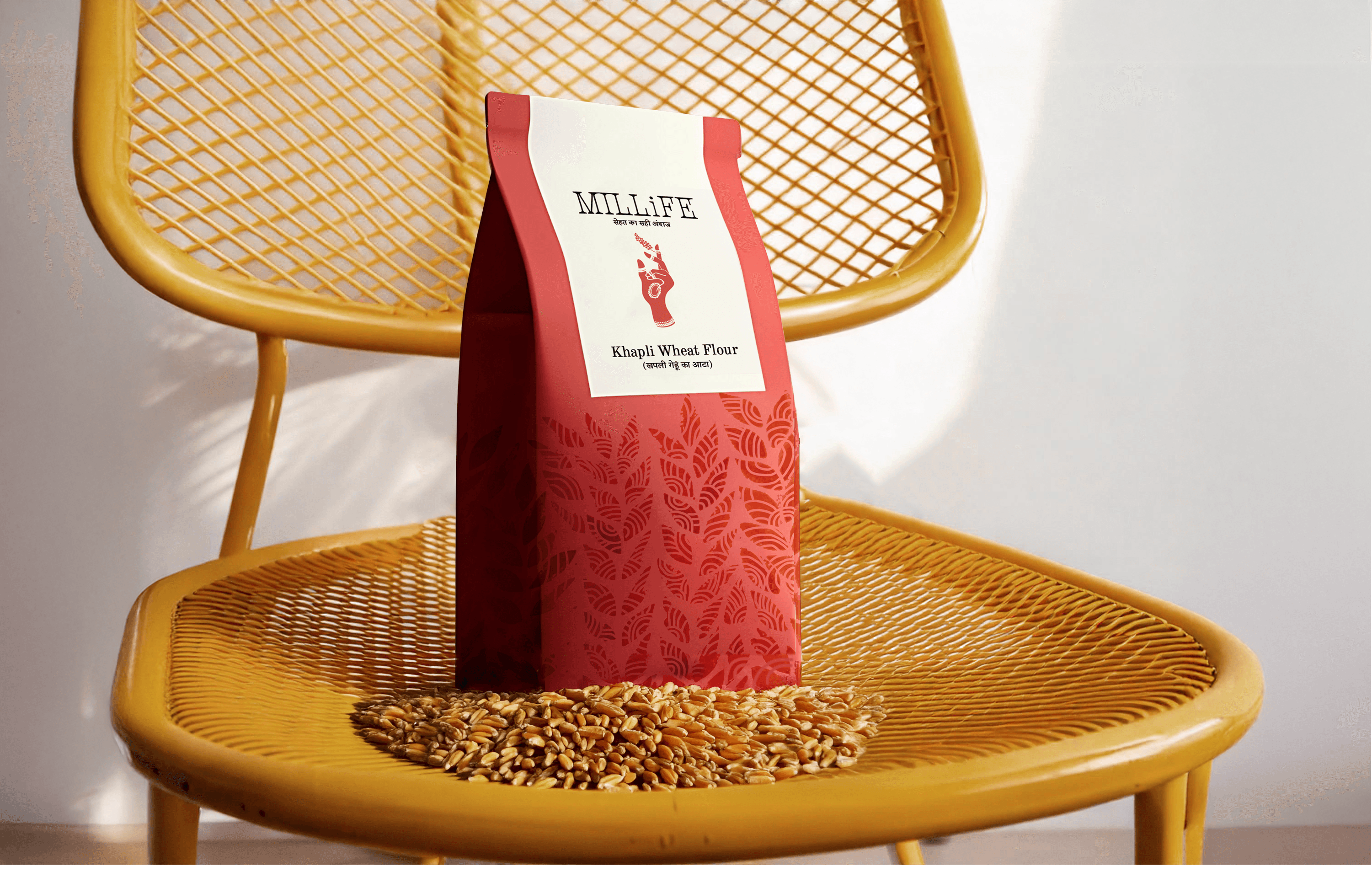
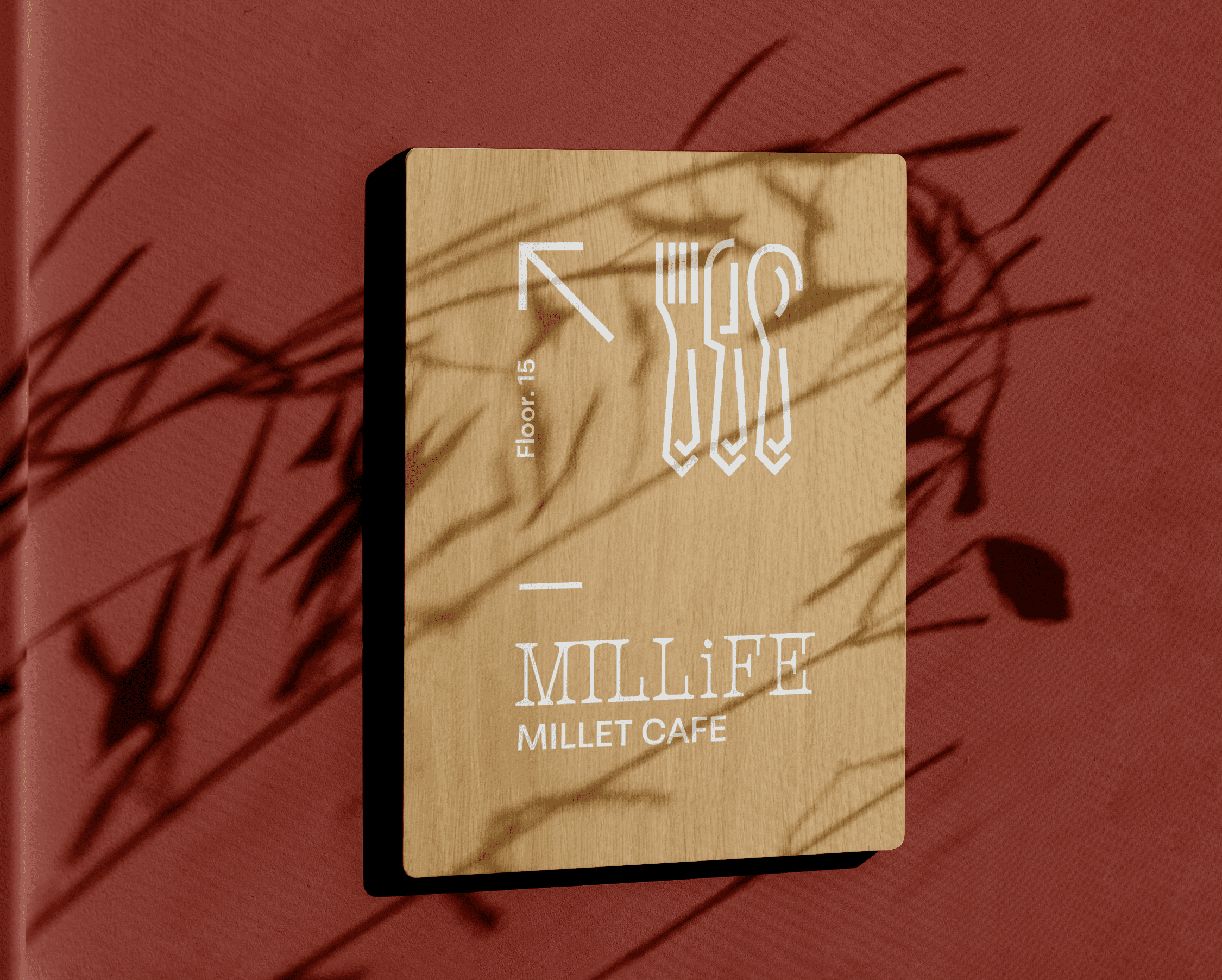
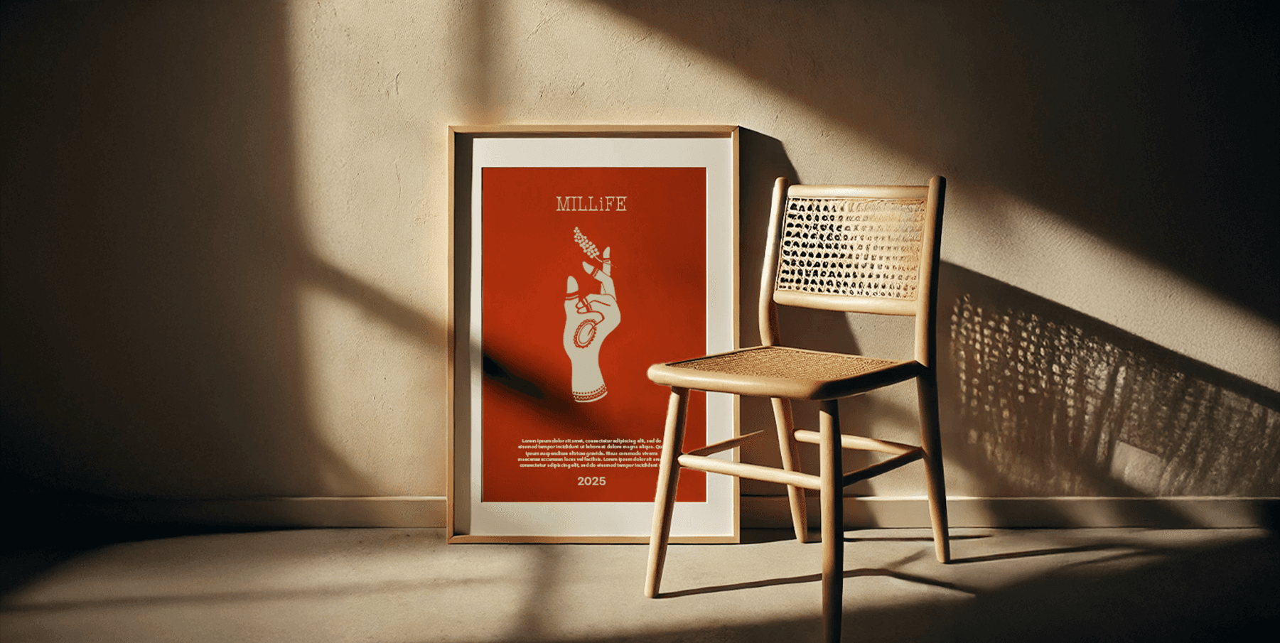
At the heart of the branding is the logo: a hand adorned with mehendi, symbolizing the 40,000 women workers from Jharkhand who form the backbone of the company. It’s more than just a symbol—it’s a tribute. The choice was also inspired by a local tradition in Ranchi, where only women paint intricate
patterns on the walls of their homes. That same folk art style was used to illustrate the packaging, connecting the product visually to its place of origin.
The brand color, a rich red inspired by laal maatia and the region’s distinctive
mehendi—which leaves a reddish tint—was paired with a soft beige to reflect
both vibrance and earthiness. Hindi was integrated into the visual language to
keep the identity rooted in culture, ensuring that Millife felt local, proud, and
personal.
For Millife, the challenge was to create a brand identity that celebrated the
deep cultural and human roots behind the millet. This is the direction the
client chose, and with good reason—it beautifully brought together tradition,
craft, and purpose.
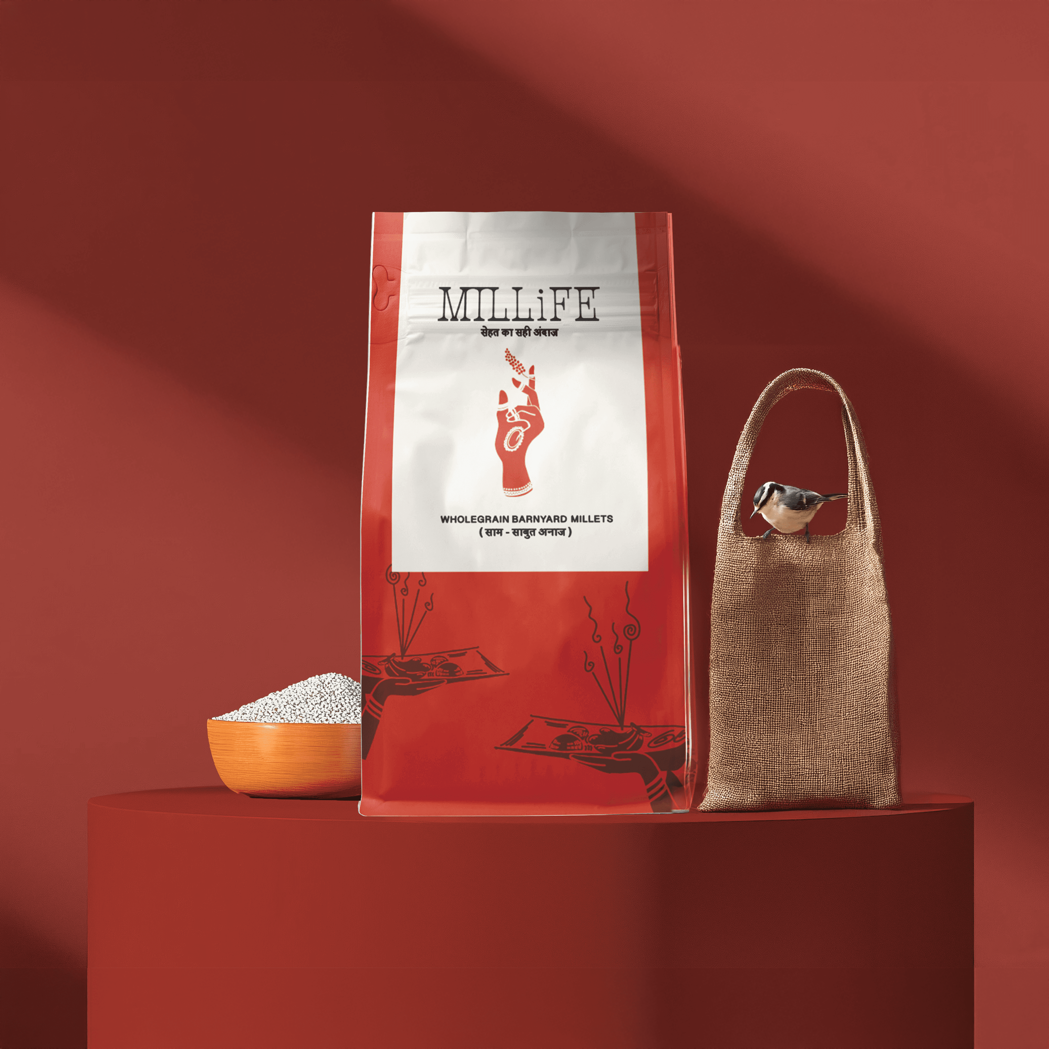
At the heart of the branding is the logo: a hand adorned with mehendi,
symbolizing the 40,000 women workers from Jharkhand who form the
backbone of the company. It’s more than just a symbol—it’s a tribute. The
choice was also inspired by a local tradition in Ranchi, where only women
paint intricate patterns on the walls of their homes. That same folk art style
was used to illustrate the packaging, connecting the product visually to its
place of origin.
The brand color, a rich red inspired by laal maatia and the region’s
distinctive mehendi—which leaves a reddish tint—was paired with a soft
beige to reflect both vibrance and earthiness. Hindi was integrated into the
visual language to keep the identity rooted in culture, ensuring that Millife
felt local, proud, and personal.
For Millife, the challenge was to create a brand identity that celebrated the deep
cultural and human roots behind the millet. This is the direction the client chose,
and with good reason—it beautifully brought together tradition, craft, and
purpose.
At the heart of the branding is the logo: a hand adorned with mehendi,
symbolizing the 40,000 women workers from Jharkhand who form the backbone of the company. It’s more than just a symbol—it’s a tribute. The choice was also inspired by a local tradition in Ranchi, where only women paint intricate patterns on the walls of their homes. That same folk art style was used to illustrate the packaging, connecting the product visually to its place of origin.
The brand color, a rich red inspired by laal maatia and the region’s distinctive
mehendi—which leaves a reddish tint—was paired with a soft beige to reflect both vibrance and earthiness. Hindi was integrated into the visual language to
keep the identity rooted in culture, ensuring that Millife felt local, proud, and
personal.
For Millife, the challenge was to create a brand identity that celebrated the deep
cultural and human roots behind the millet. This is the direction the client chose,
and with good reason—it beautifully brought together tradition, craft, and
purpose.
At the heart of the branding is the logo: a hand adorned with mehendi, symbolizing the 40,000 women workers from Jharkhand who form the backbone of the company. It’s more than just a symbol—it’s a tribute. The choice was also inspired by a local tradition in Ranchi, where only women paint intricate
patterns on the walls of their homes. That same folk art style was used to illustrate the packaging, connecting the product visually to its place of origin.
The brand color, a rich red inspired by laal maatia and the region’s distinctive
mehendi—which leaves a reddish tint—was paired with a soft beige to reflect
both vibrance and earthiness. Hindi was integrated into the visual language to
keep the identity rooted in culture, ensuring that Millife felt local, proud, and
personal.
Millet Products | Branding & Packaging 2025
Millet Products | Branding &
Packaging 2025