Functional Chocolates | Packaging 2024
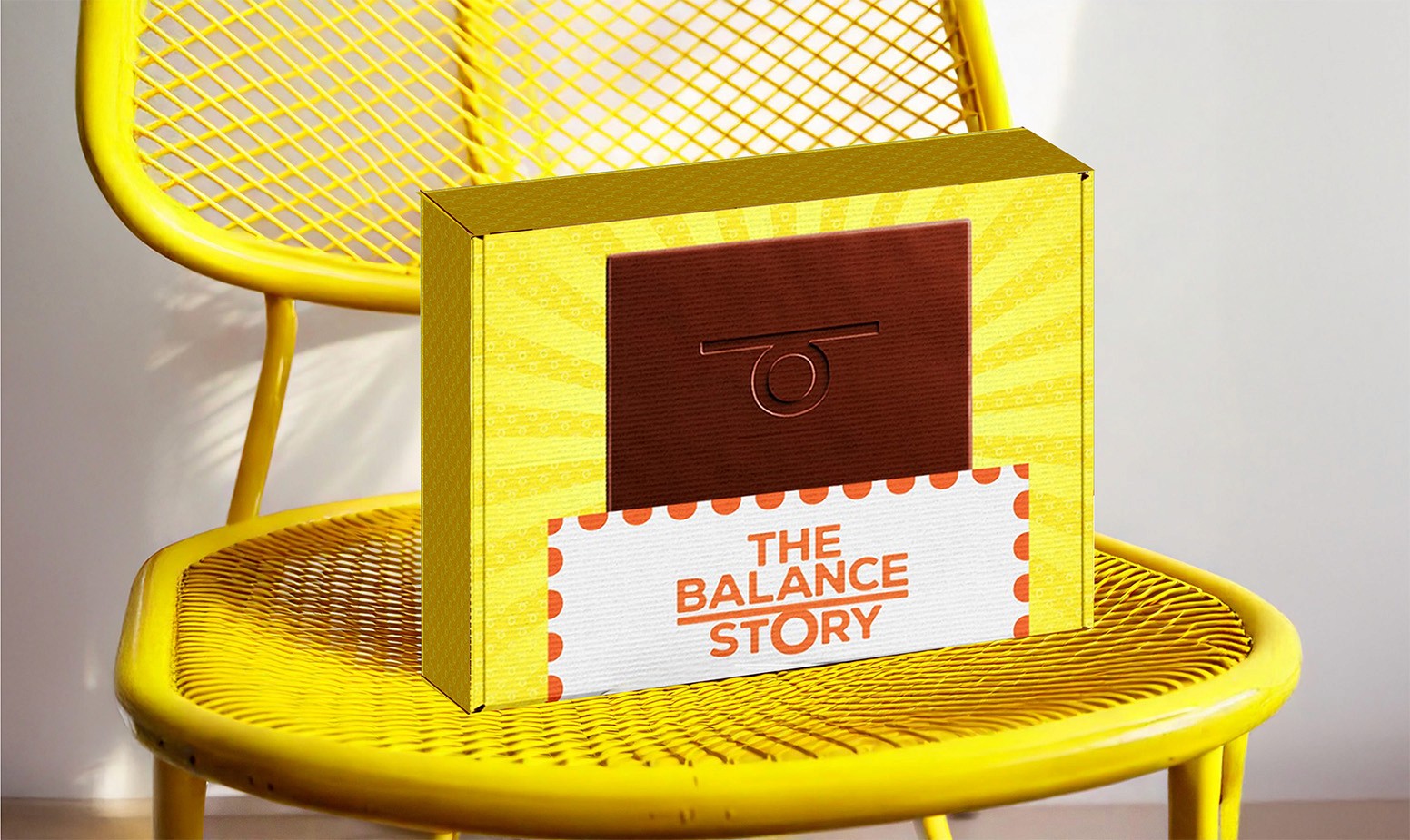
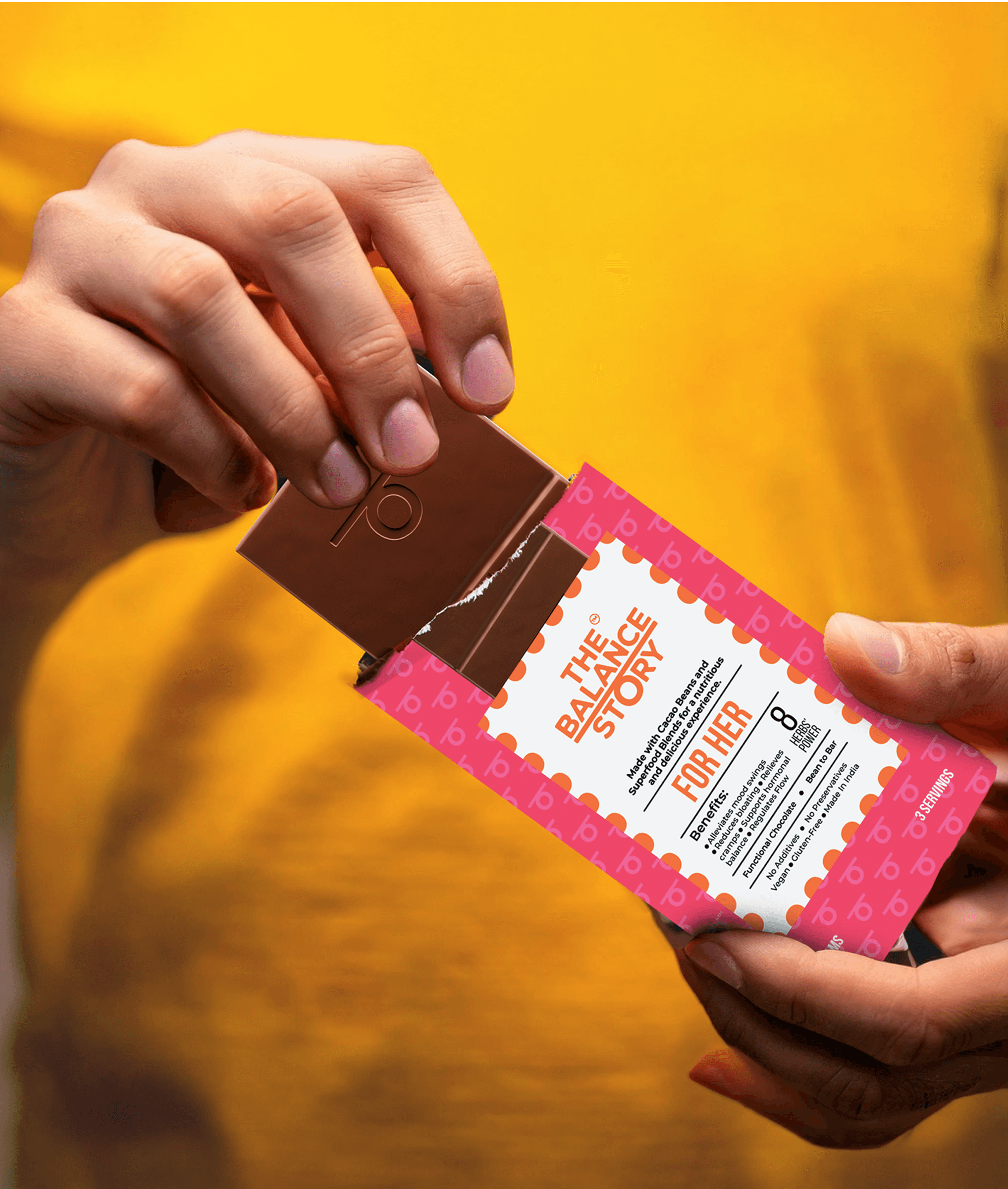
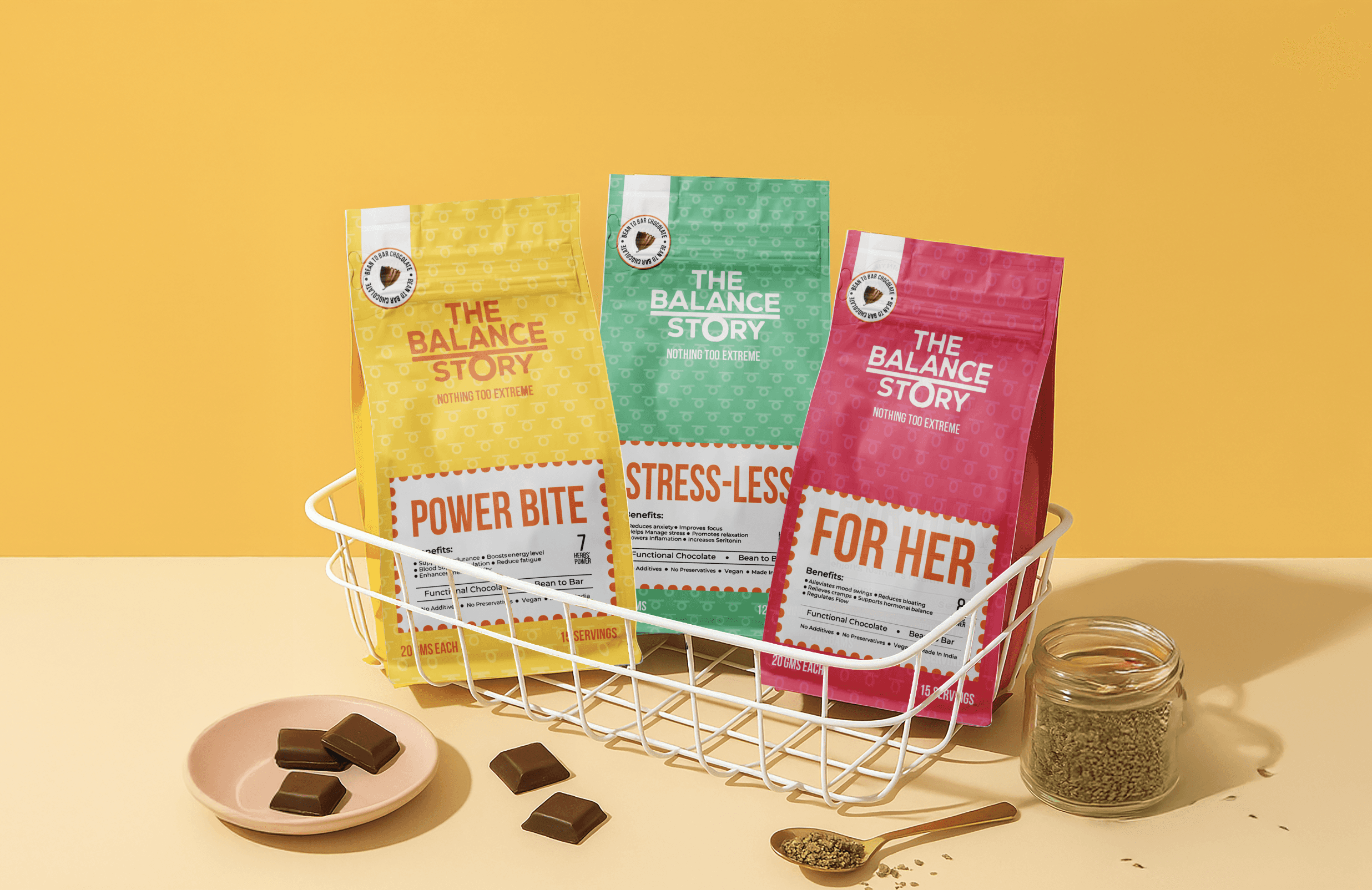
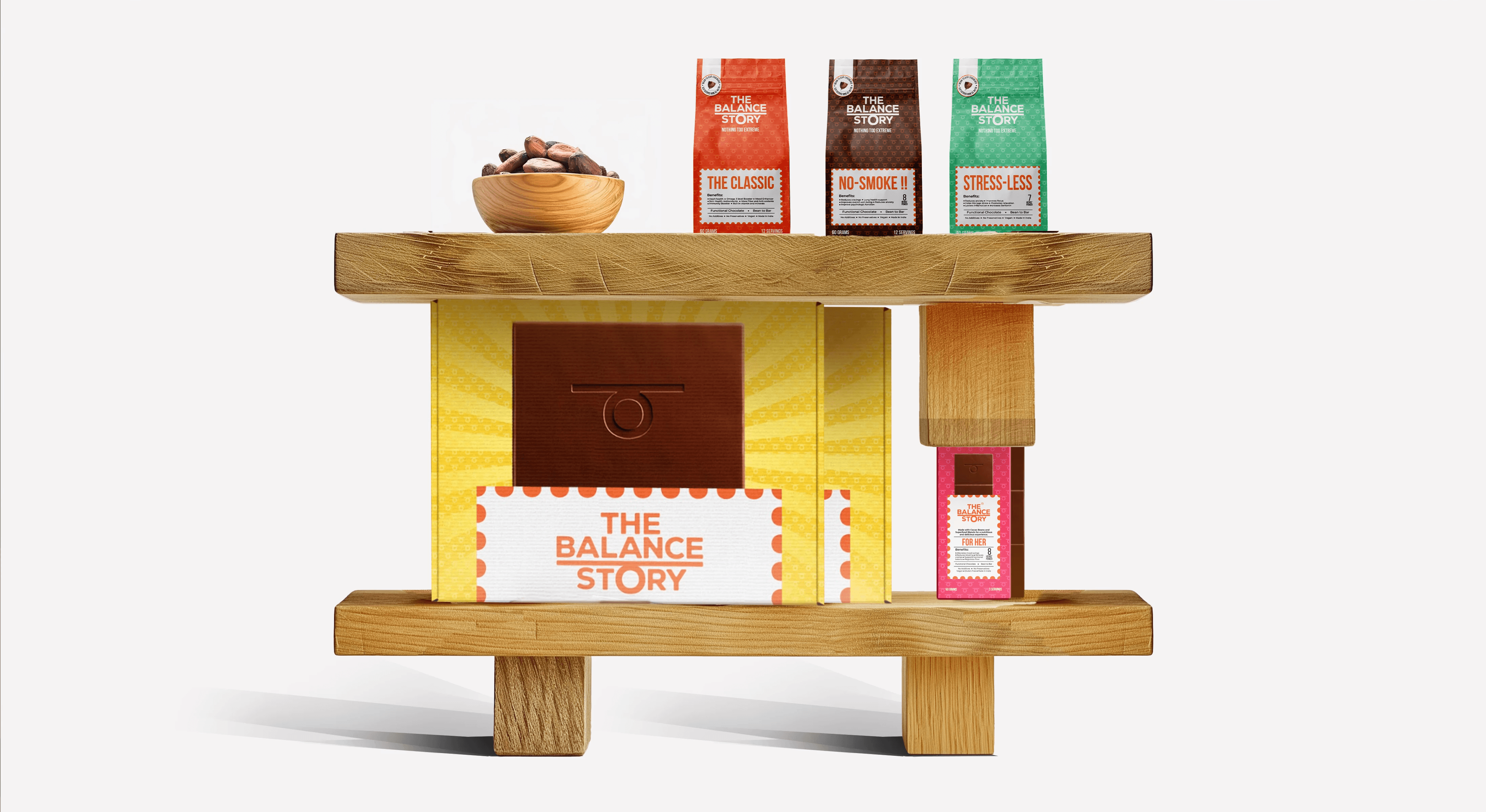
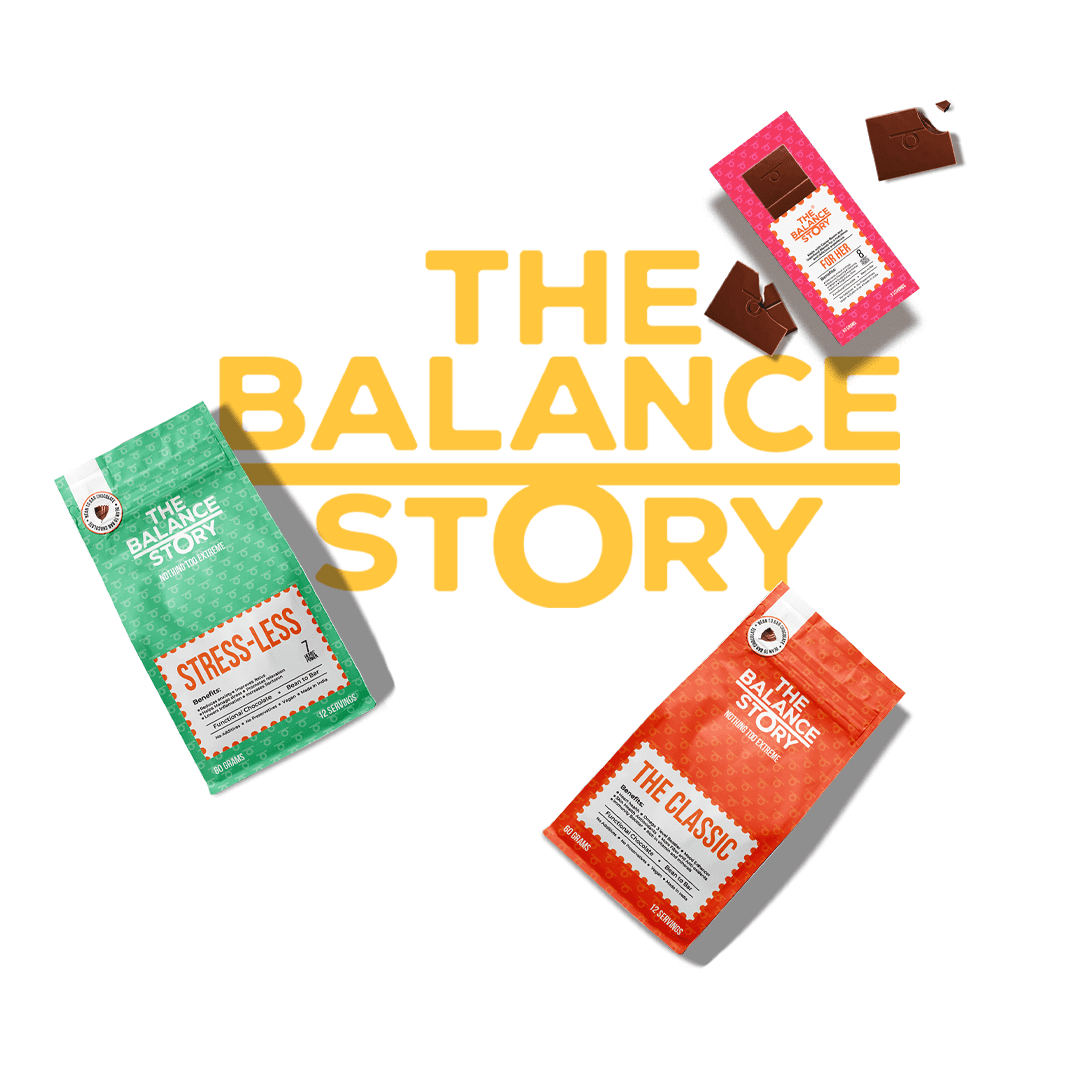
For The Balance Story, the challenge was to design packaging that clearly differentiated each herb-infused chocolate variant while conveying their functional benefits and aligning with the brand's ethos of "Nothing too extreme."
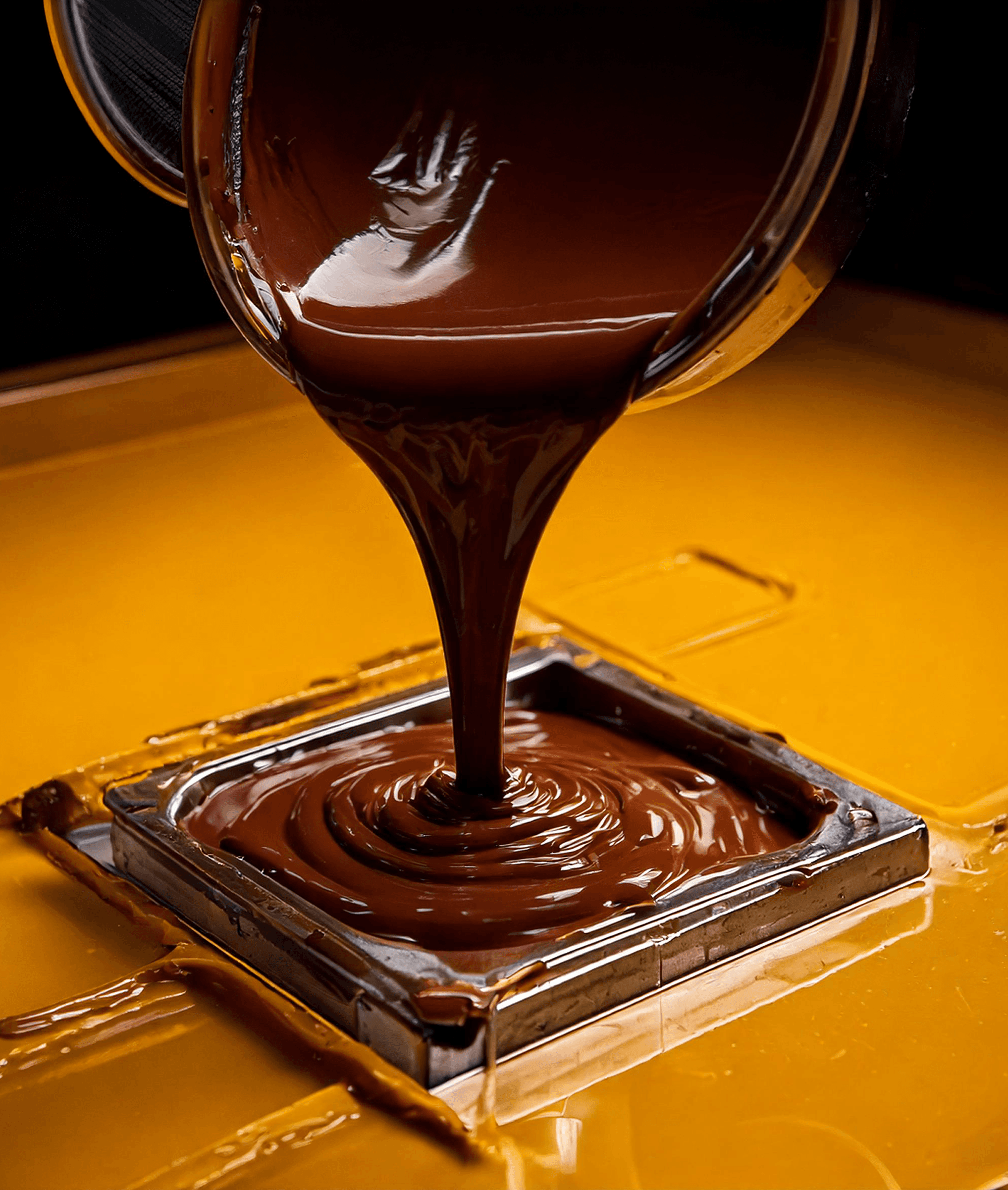
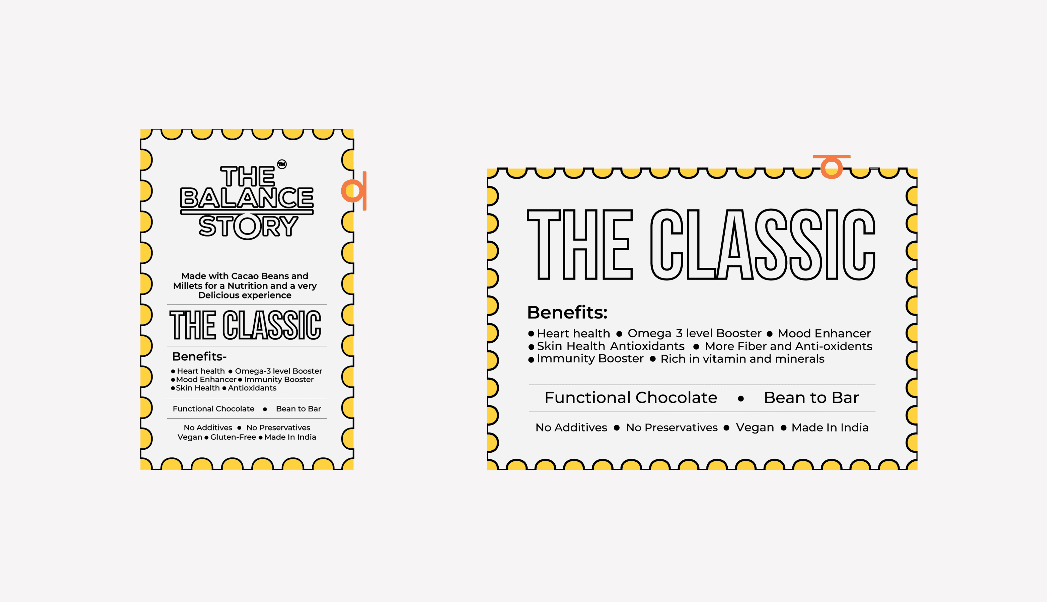
To address this, I implemented a color-coded system where each packaging hue corresponded to the chocolate's specific benefit—such as using a calming light green for the stress-relief variant, leveraging color psychology to reinforce the intended effect. A subtle, playful pattern derived from the brand's logo was incorporated to reinforce identity without overwhelming the minimalist aesthetic. High-quality images of the chocolates were placed prominently to ensure immediate recognition and appeal. The packaging also featured a slightly vintage design to mirror the traditional herbal ingredients, bridging the gap between old-world remedies and modern snacking. The final design successfully communicated the brand's ethos, offering a visually appealing and functional solution that resonated with health-conscious consumers.
Functional Chocolates | Packaging 2024
Functional Chocolates | Packaging 2024
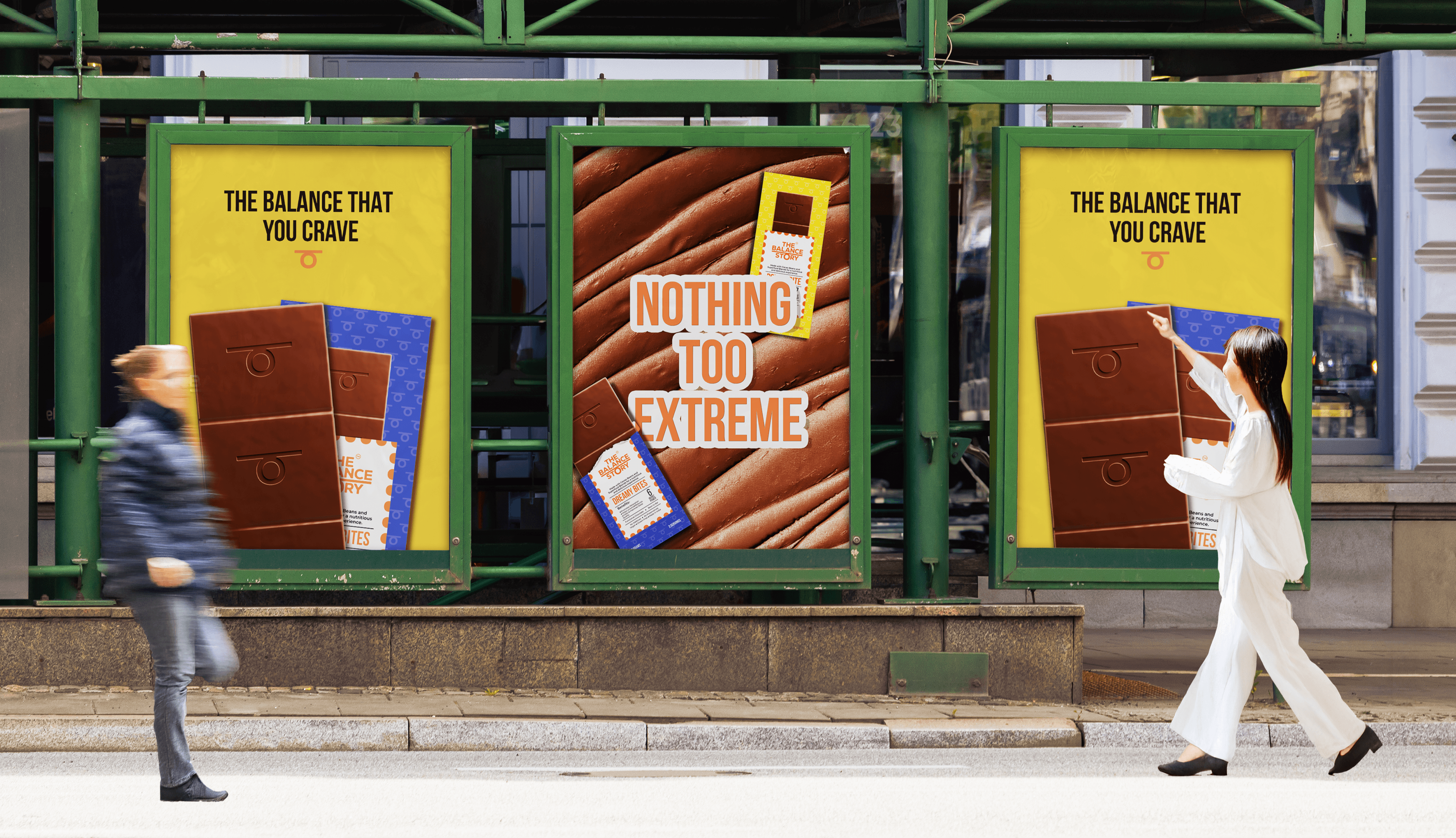
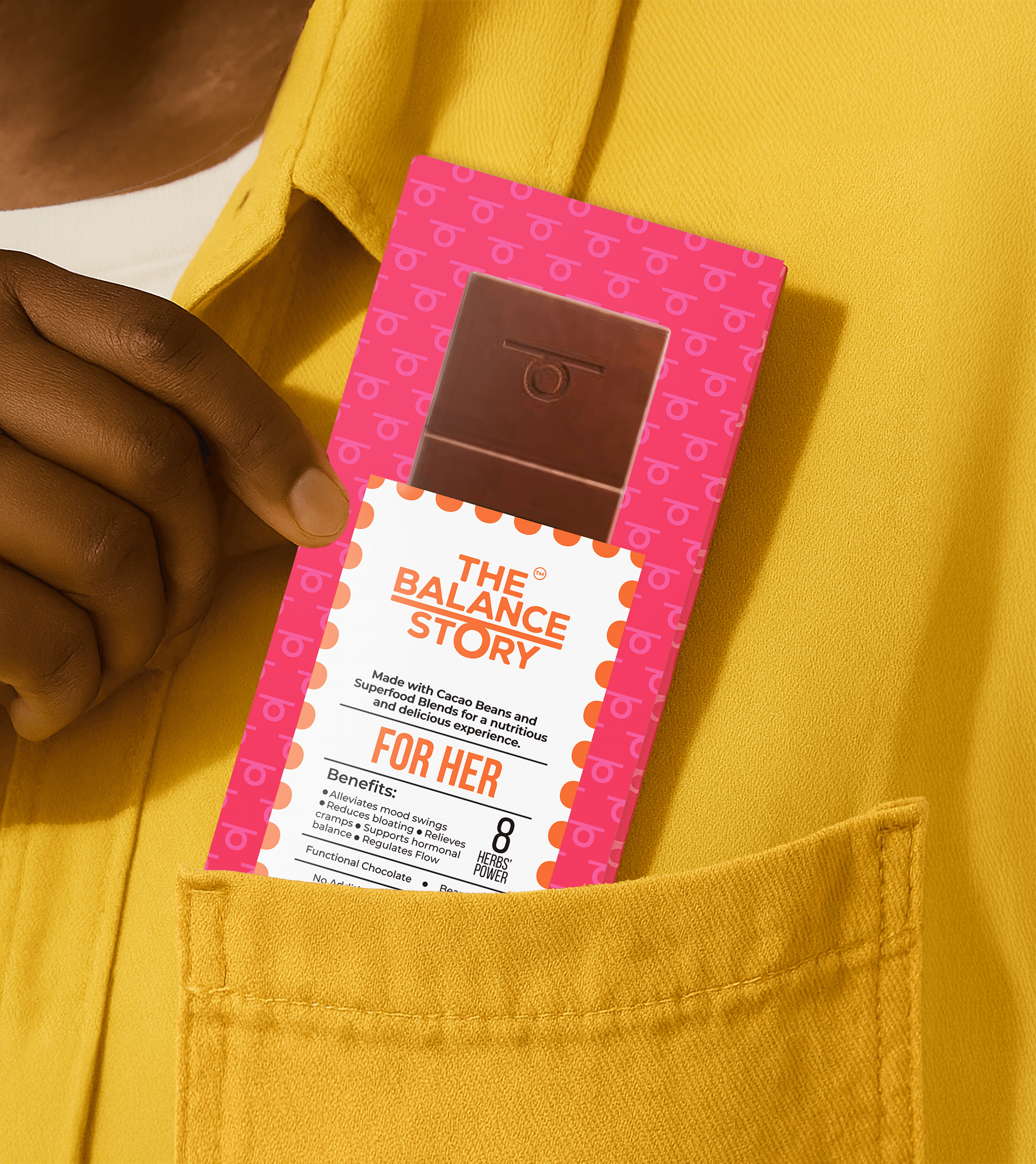
For The Balance Story, the challenge was to design packaging that clearly differentiated each herb-infused chocolate variant while conveying their functional benefits and aligning with the brand's ethos of "Nothing too extreme."
To address this, I implemented a color-coded system where each packaging hue corresponded to the chocolate's specific benefit—such as using a calming light green for the stress-relief variant, leveraging color psychology to reinforce the intended effect. A subtle, playful pattern derived from the brand's logo was incorporated to reinforce identity without overwhelming the minimalist aesthetic. High-quality images of the chocolates were placed prominently to ensure immediate recognition and appeal. The packaging also featured a slightly vintage design to mirror the traditional herbal ingredients, bridging the gap between old-world remedies and modern snacking. The final design successfully communicated the brand's ethos, offering a visually appealing and functional solution that resonated with health-conscious consumers.
Functional Chocolates | Packaging 2024
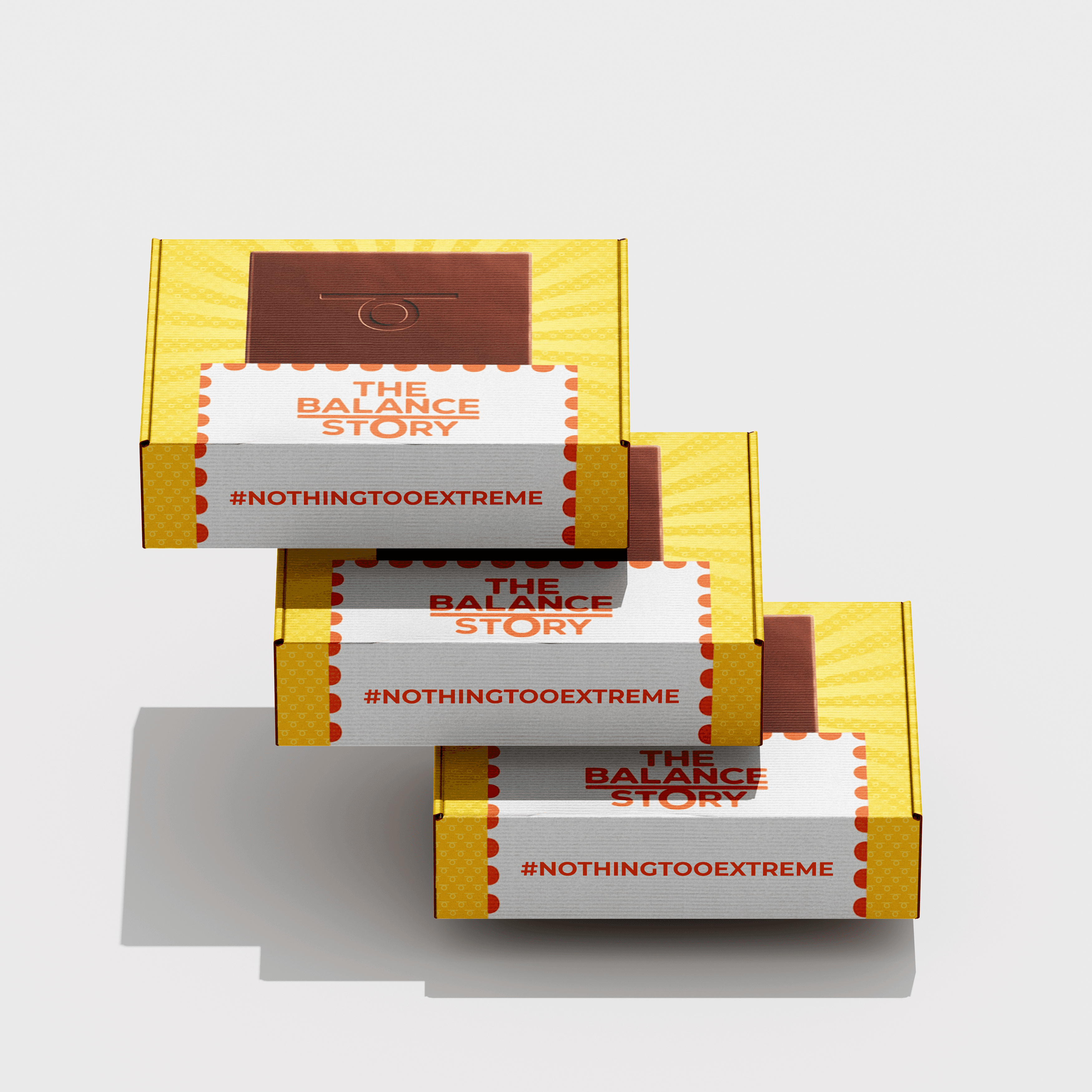
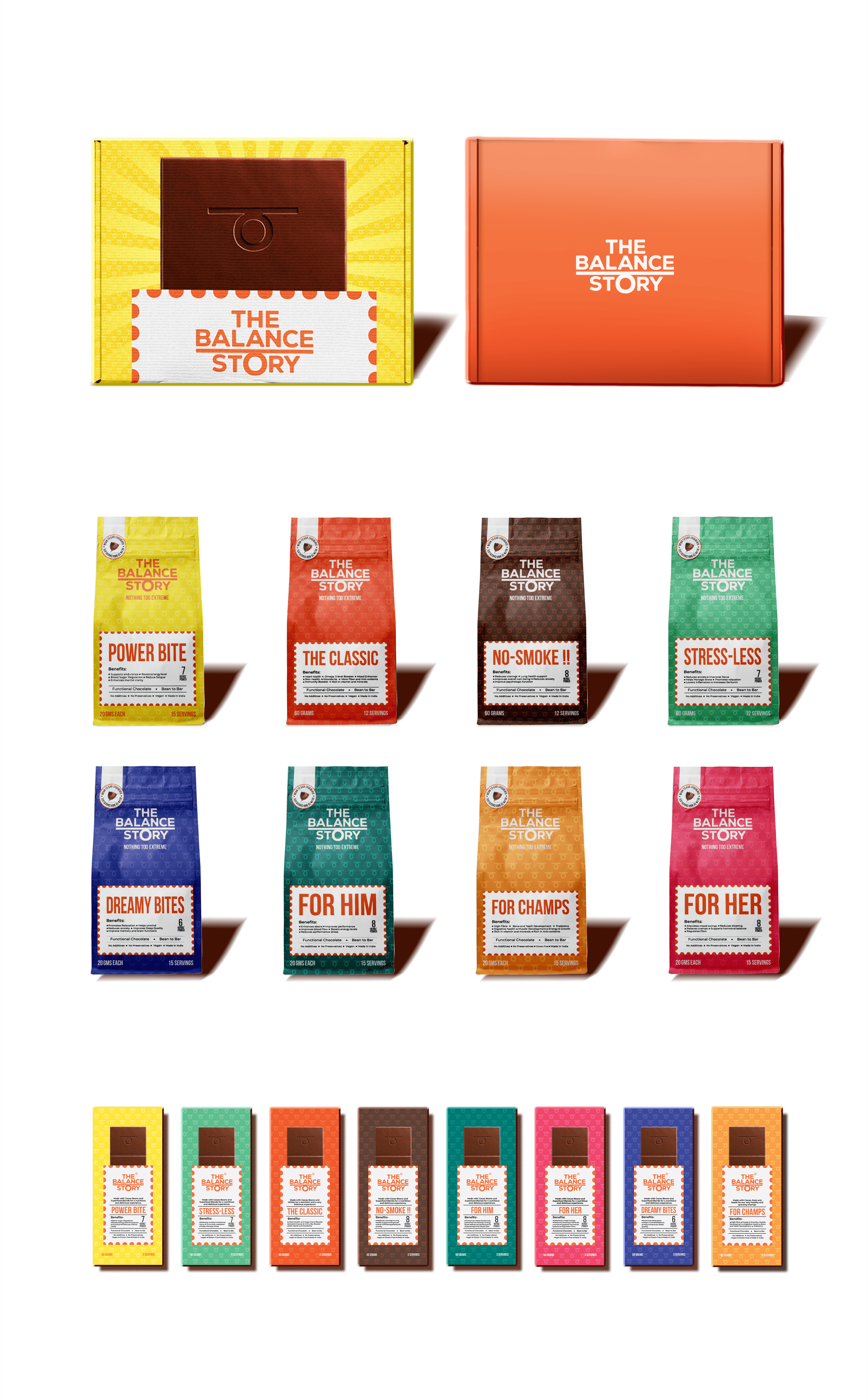