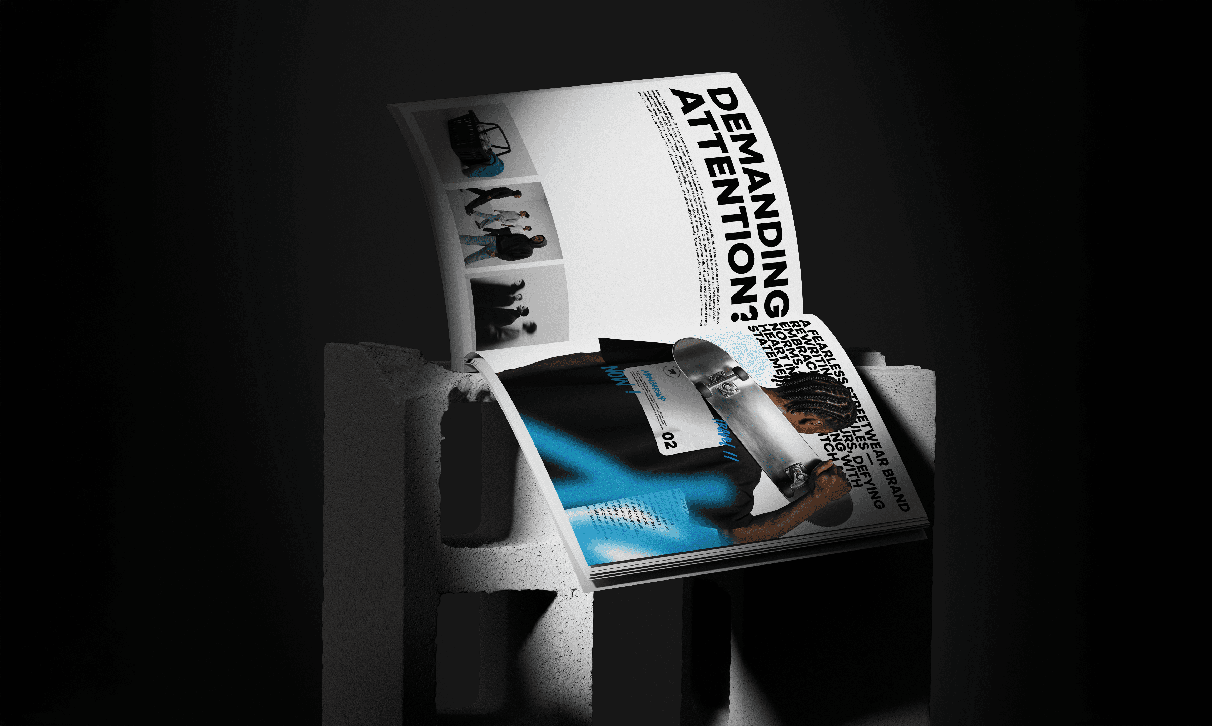
Streetwear | Branding 2024
For The Balance Story, the challenge was to design packaging that clearly
differentiated each herb-infused chocolate variant while conveying their
functional benefits and aligning with the brand's ethos of "Nothing too
extreme."
To address this, I implemented a color-coded system where each packaging hue corresponded to the chocolate's specific benefit—such as using a calming light green for the stress-relief variant, leveraging color psychology to reinforce the intended effect. A subtle, playful pattern derived from the brand's logo was incorporated to reinforce identity without overwhelming the minimalist aesthetic. High-quality images of the chocolates were placed prominently to ensure immediate recognition and appeal. The packaging also featured a slightly vintage design to mirror the traditional herbal ingredients, bridging the gap between old-world remedies and modern snacking. The final design successfully communicated the brand's ethos, offering a visually appealing and functional solution that resonated with health-conscious consumers.
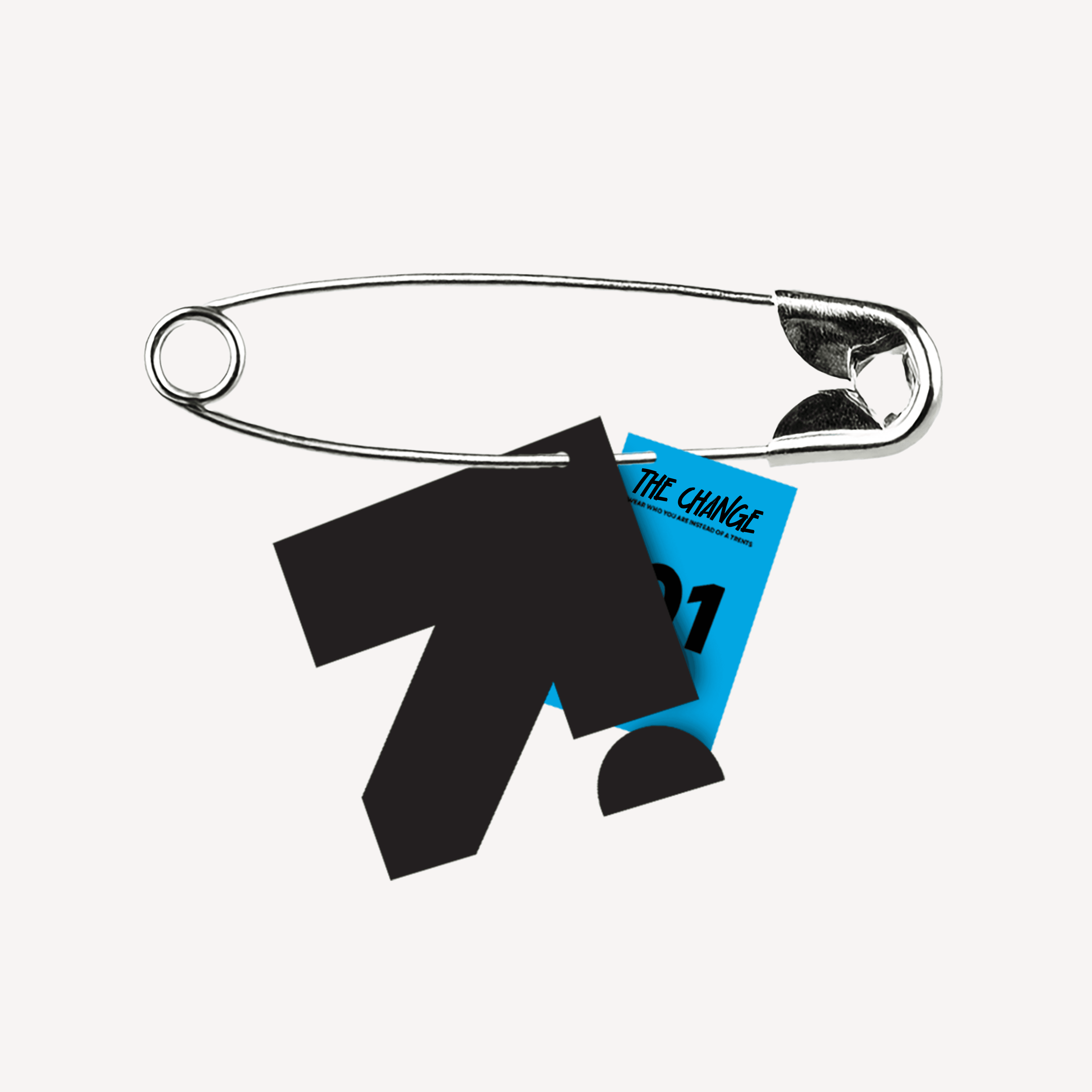
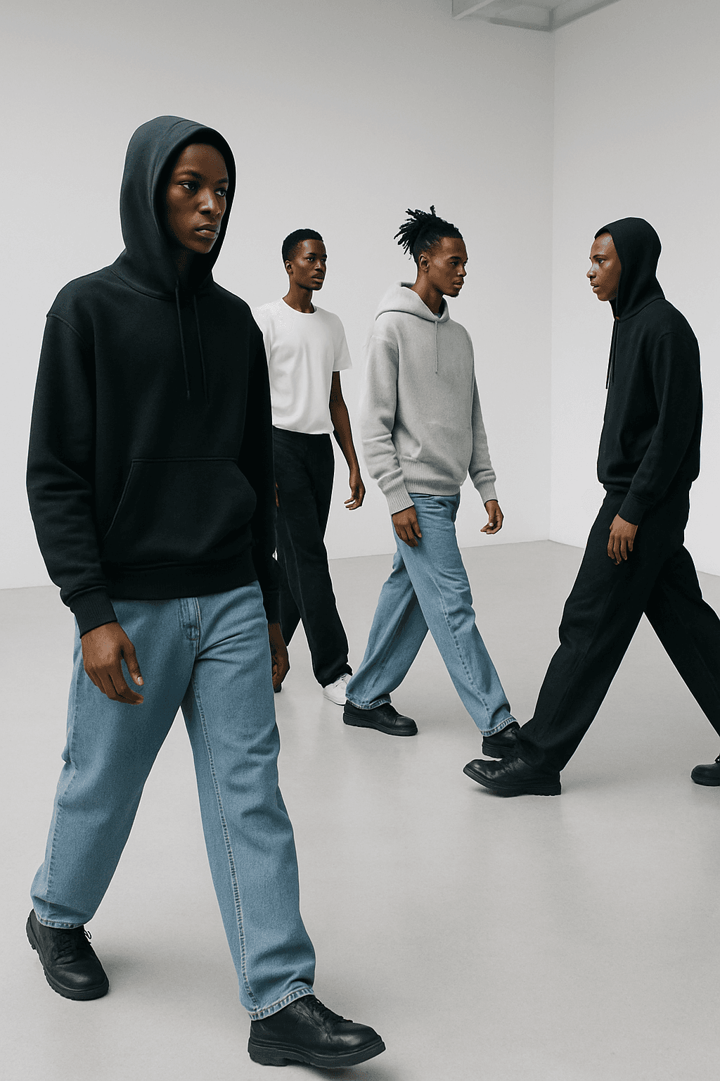
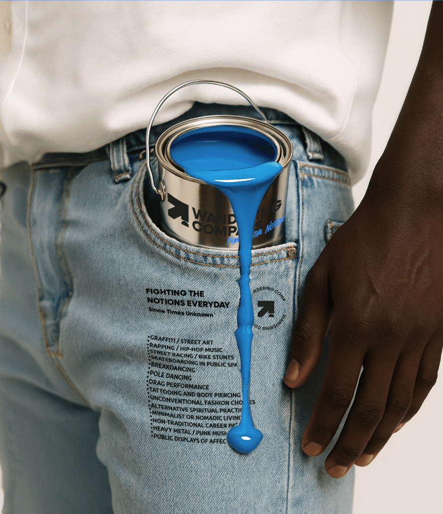
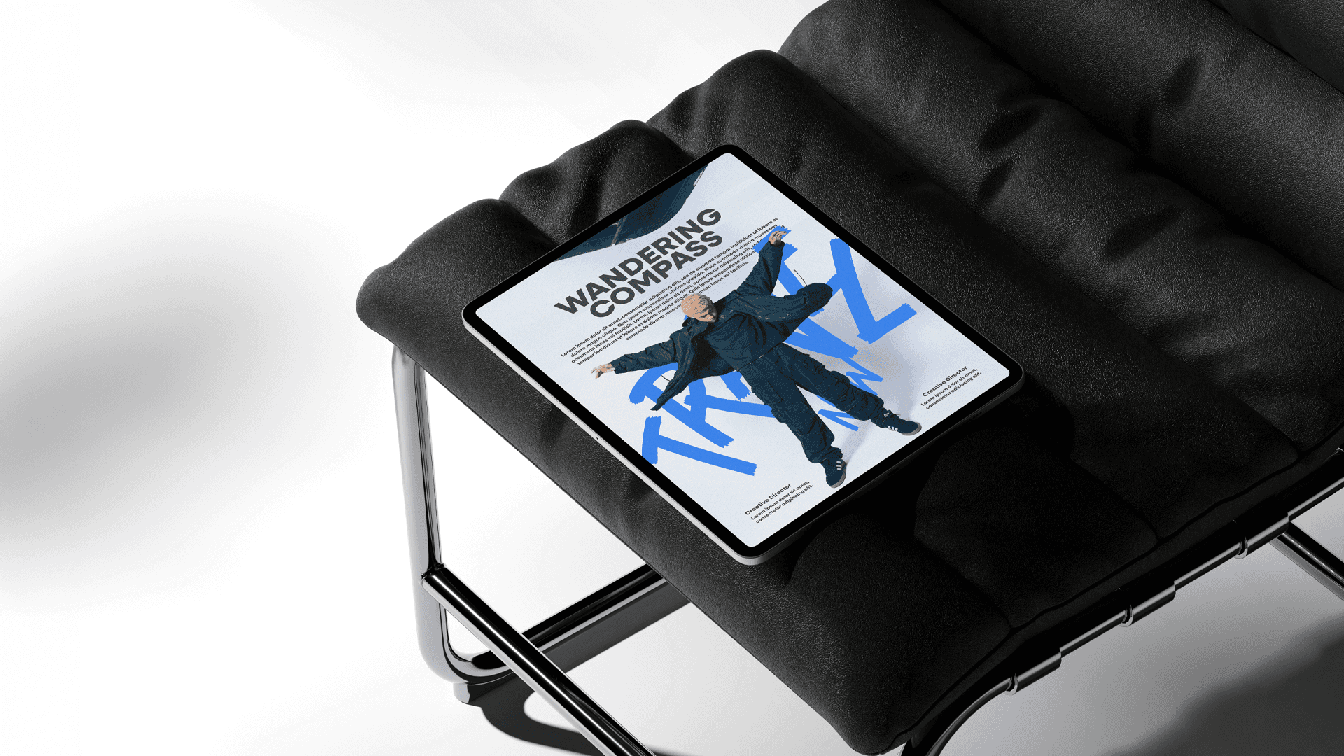
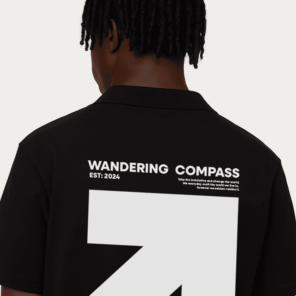
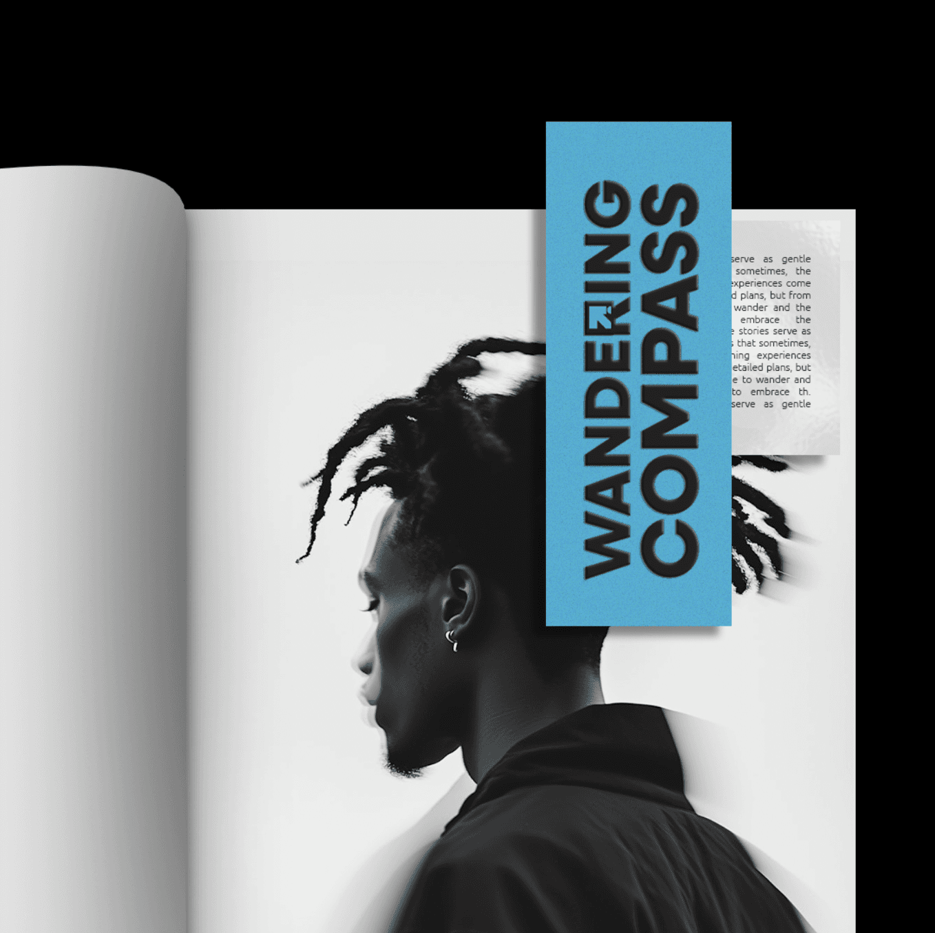
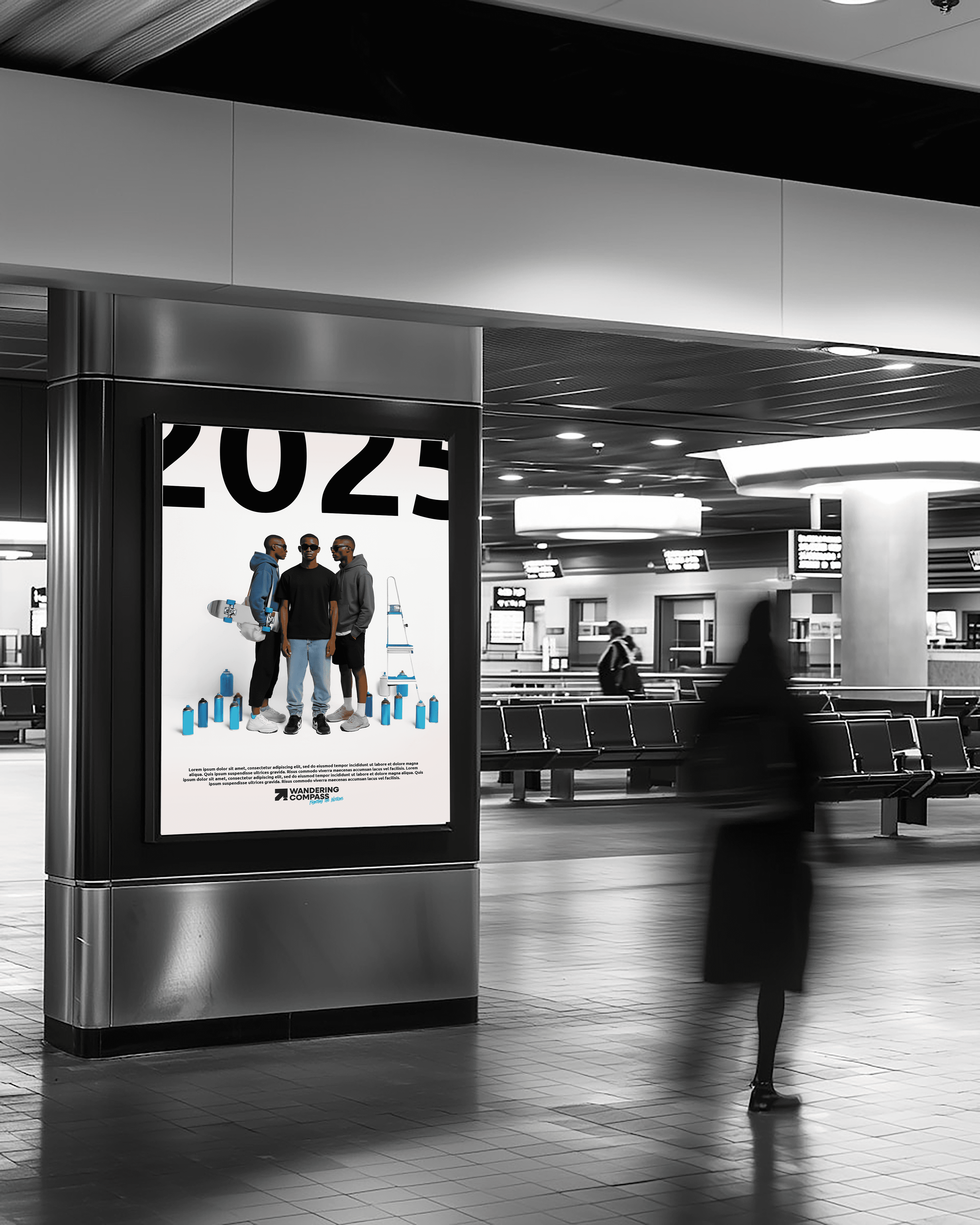
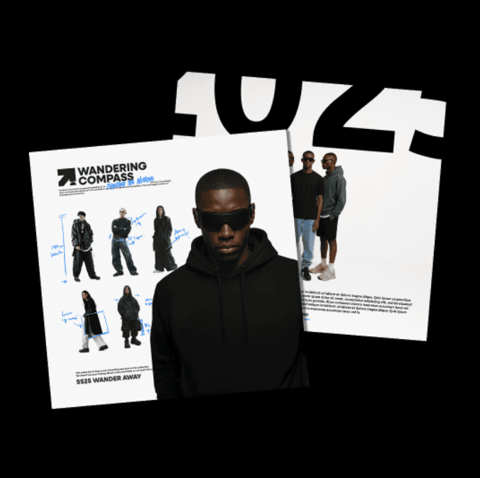
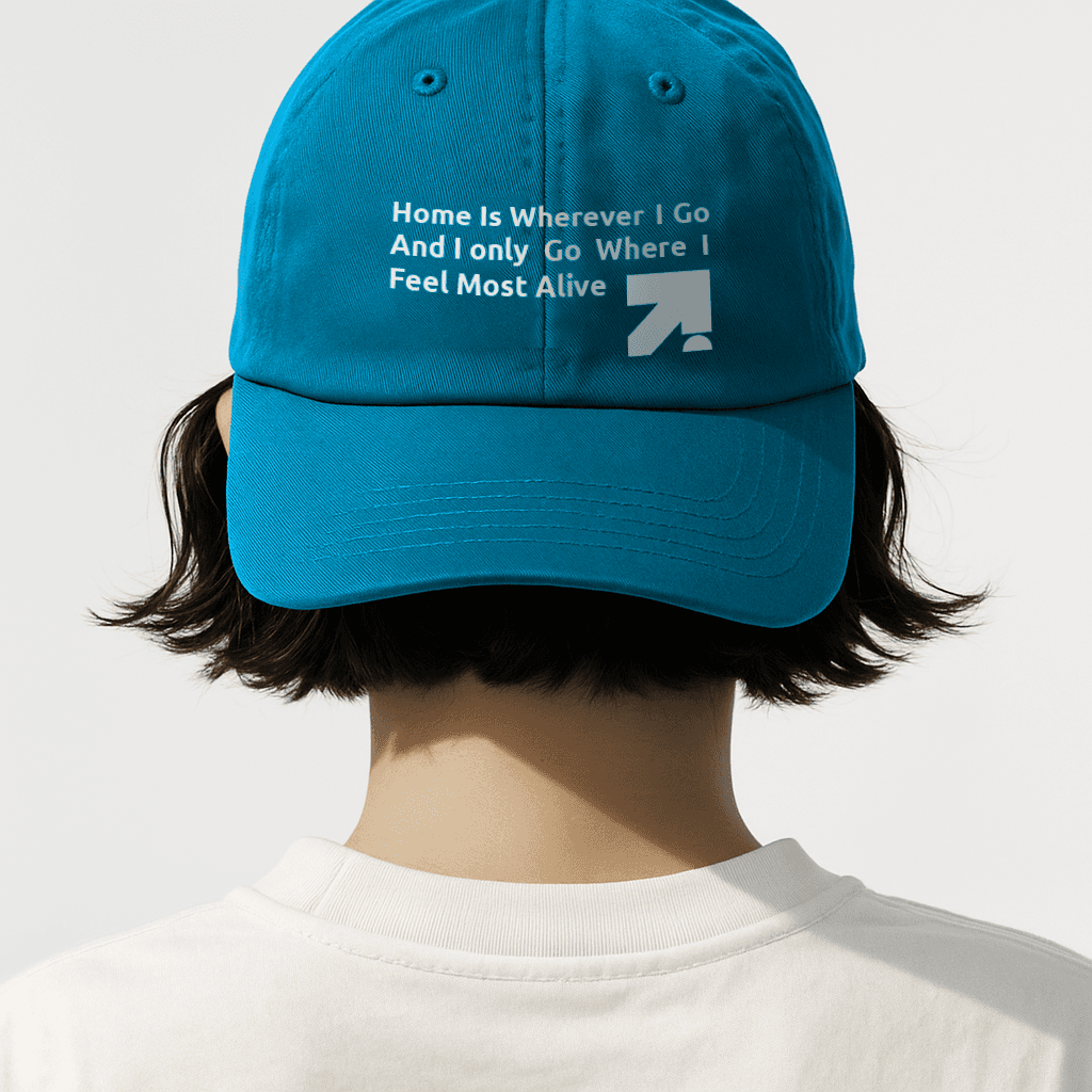
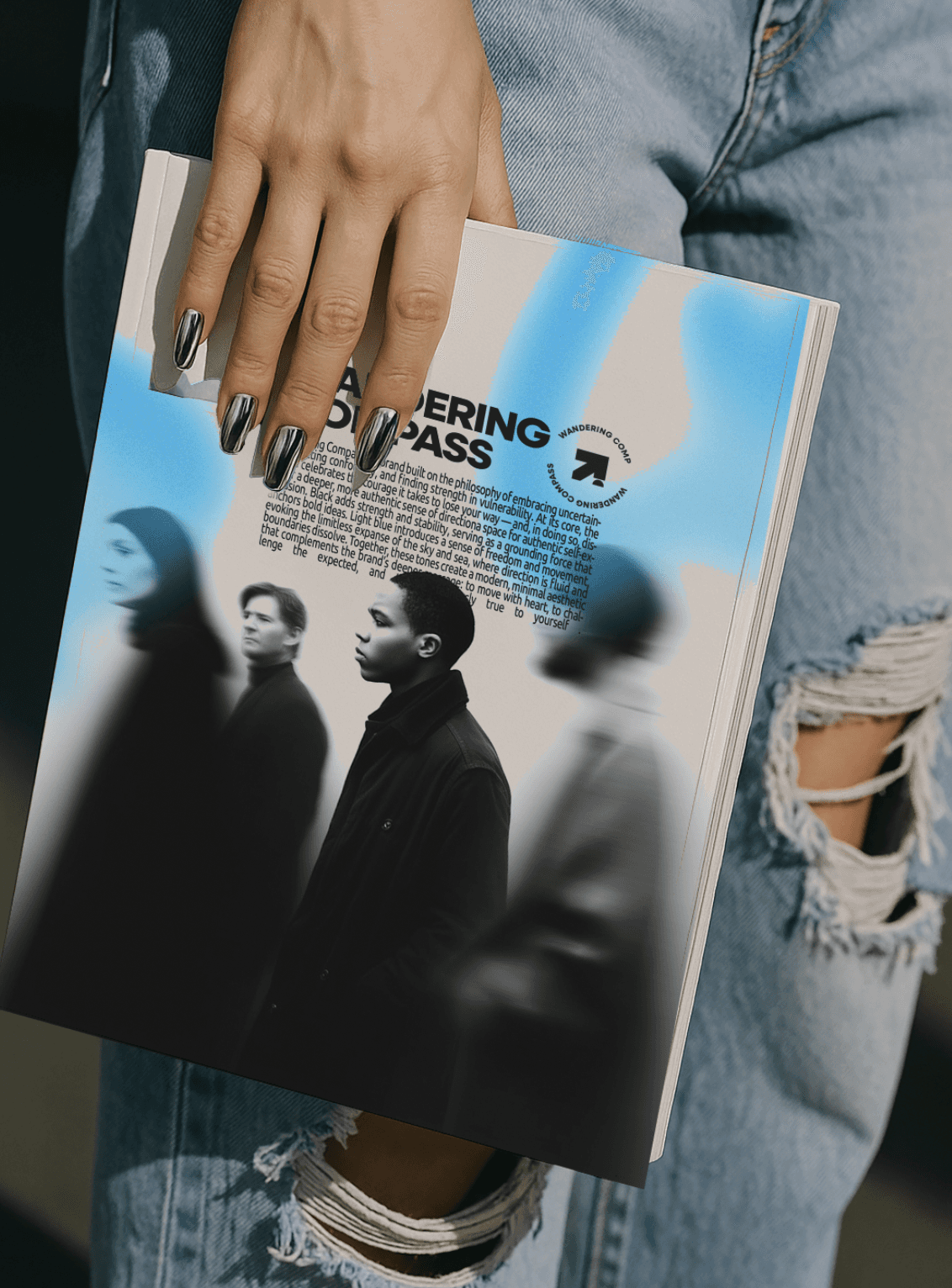
For Wandering Compass, the challenge was to create a branding that captured the rebellious essence of the brand —one that urges wearers to “fight the notion” and be fearless in an elevated fashion. While this direction wasn’t ultimately the one the brand moved forward with, it was a concept I personally connected with the most.
The design leaned into the brand’s streetwear roots, with a modern, stripped-down aesthetic that was bold yet intentional. At the heart of the concept was a powerful visual identity centered around the brand’s logo: a simplified compass needle deliberately pointing away from true north. This symbol, minimalist yet unmistakable, embodied the core ethos of defiance, individualism, and charting your own path.
The color palette shows a stark trio of black, white, and grey, conveying clarity, contrast, and a sense of seriousness. This is elevated with accents of electric blue, a deliberate choice to inject an unexpected jolt of energy standing against the greyscale. The shade evoked movement, digital culture, and urban dynamism while still feeling grounded and masculine. Experimental typography has also been used.
Streetwear | Branding 2024